Can Primary Elections Cause Polarization? A Toy Model
Introduction
There has been much speculation that Americans have become more politically polarized in recent years. But the evidence seems to point to political parties become more polarized rather than the population itself. In other words, there is more ideoleogical sorting in party membership than before. Andrew Gelman recently blogged about this (citing a post by Claude Fischer), and I agree with his observation that it seems like people tend to cast votes more against the other side than for their own these days.
Allen Downey looked at survey results a couple of years ago and came to a similar conclusion. He also points out that "the percentage of Nonpartisans has increased to the point where they are now the plurality."
In this post, I will present a toy model that extends the median voter theorem to show how primary presidential elections might lead to these results. To be clear, I will prove nothing here. I won't even try to fit a model to empirical data. This is more in the spirit of Schelling's segregation model, which showed how slight in-group preferences could lead to highly segregated housing. He never claimed this was the only cause or even the primary cause of observed, real-life segregation; merely that it was a plausible mechanism through which housing segregation could occur. Similarly, I'll just try to give an intuition of how primary elections might lead to political polarization and growing independents under some assumptions.
The median voter theorem and Hotelling's law
The median voter theorem supposes that voters have preferences along a one-dimensional spectrum and that voters cast votes for the candidate closest to their position, and then states voters will elect the candidate whose position is closest to the median voter. I'm also supposing Hotelling's law behavior, whereby politicians will position themselves at the median to win elections. I'm simplifying a bit, but that's a good enough intuition in a "one person, one vote" system.
Attribution: Colin.champion, CC BY-SA 4.0, via Wikimedia Commons
Extension and repetition
In this post, I will suppose the following:
- Political positions of the electorate are well described by a Gaussian distribution
- The winning candidate of party's primary positions his or herself at the median vote of that party
- Voters use presidential nominees as flagpoles of each party's position
- Voters estimate the midpoint between flagpoles of each party, and this midpoint become the flagpole for independents
- Voters then categorize themselves according to the flagpole that is closest to them
In other words, this model represents people choosing to affiliate with whatever is closest to their views: one of two parties or the midpoint between them.
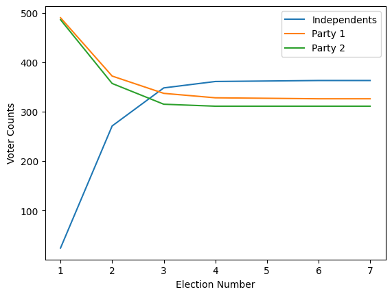
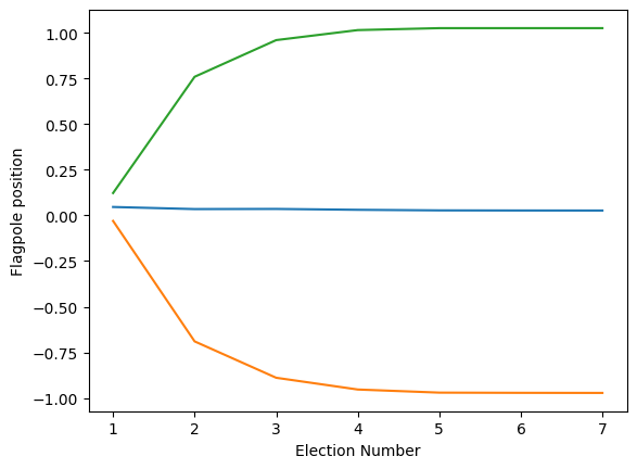
We will develop a toy model for this, and see how it leads to growing polarization between parties and a growing number of independents over time.
import numpy as np
import matplotlib.pyplot as plt

# generate first voters, who each belong to a party to start
np.random.seed(3)
party1 = np.random.normal(0, 1, size=500)
party2 = np.random.normal(0, 1, size=500)

all_voters = np.hstack([party1, party2])

party1_flagpole = np.median(party1)
party2_flagpole = np.median(party2)
independent_flagpole = (party1_flagpole + party2_flagpole)/2

party_array = np.array([independent_flagpole, party1_flagpole, party2_flagpole])
rounds = 7
results = np.empty((rounds, len(all_voters)))
flagpoles = np.empty((rounds, 3))
for i in range(rounds):
    flagpoles[i, :] = party_array
    closest_indices = np.abs(all_voters[:, np.newaxis] - party_array).argmin(axis=1)
    results[i, :] = closest_indices
    # now group into new parties
    party1 = all_voters[closest_indices==1]
    party2 = all_voters[closest_indices==2]

    party1_flagpole = np.median(party1)
    party2_flagpole = np.median(party2)
    independent_flagpole = (party1_flagpole + party2_flagpole)/2
    party_array = np.array([independent_flagpole, party1_flagpole, party2_flagpole])
We can look at party membership over time
plt.plot((results==0).sum(axis=1), label='Independents')
plt.plot((results==1).sum(axis=1), label='Party 1')
plt.plot((results==2).sum(axis=1), label='Party 2')
plt.xticks(ticks=range(results.shape[0]), labels=range(1, results.shape[0] + 1))
plt.legend()
plt.gca().set_ylabel('Voter Counts')
plt.gca().set_xlabel('Election Number')
plt.show();
And look at the flagpole positions over time.
plt.plot(flagpoles)
plt.gca().set_ylabel('Flagpole position')
plt.gca().set_xlabel('Election Number')
plt.xticks(ticks=range(results.shape[0]), labels=range(1, results.shape[0] + 1))
plt.show();
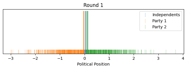
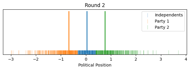
Let's look at how it evolves over time with voters and their relative positions.
party_colors = ['C0', 'C1', 'C2']
party_names = ['Independents', 'Party 1', 'Party 2']
for round_idx in range(rounds):
    plt.figure(figsize=(8, 2))

    for party in range(3):
        party_voters = all_voters[results[round_idx] == party]
        plt.scatter(
            party_voters,
            np.zeros_like(party_voters),
            color=party_colors[party],
            marker='|',
            s=100,
            label=party_names[party],
            alpha=0.2,
        )

    for party in range(3):
        flagpole_pos = flagpoles[round_idx, party]
        plt.plot(
            [flagpole_pos, flagpole_pos],
            [0, 0.2],
            color=party_colors[party],
            linestyle='-',
            linewidth=2,
            label="_nolegend_",
        )

    plt.title(f'Round {round_idx + 1}')
    plt.gca().set_xlabel('Political Position')
    plt.yticks([])
    plt.legend()

    plt.show()

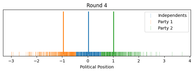


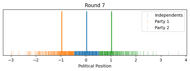
Now instead of showing it by political position on the x-axis, let's give each voter equal width on the x-axis to better show how the proportions change. We'll align the flagpoles with the closest voter.
for round_idx in range(rounds):
    plt.figure(figsize=(8, 2))

    # voter positions and the corresponding party votes for this round
    voters_positions = all_voters
    parties = results[round_idx]

    # sort voters and their corresponding party by their position
    sorted_indices = np.argsort(voters_positions)
    sorted_voters = voters_positions[sorted_indices]
    sorted_parties = parties[sorted_indices].astype(int)

    # generate evenly spaced x-values for the voters, from 0 to 1
    x_values = np.linspace(0, 1, len(sorted_voters))


    for i in range(len(sorted_voters) - 1):
        plt.plot(
            x_values[i:i + 2], [0, 0],
            color=party_colors[sorted_parties[i]],
            lw=2, alpha=0.2
        )

    # flagpoles
    for party in range(3):
        flagpole_pos = flagpoles[round_idx, party]
        nearest_voter_idx = np.abs(sorted_voters - flagpole_pos).argmin()
        nearest_voter_x = x_values[nearest_voter_idx]

        plt.axvline(
            x=nearest_voter_x,
            color=party_colors[party],
            linestyle='--',
            linewidth=2,
            label="_nolegend_"
        )

    for party in range(3):
        plt.plot([], [], color=party_colors[party], lw=2, label=party_names[party])

    plt.title(f'Round {round_idx + 1}')
    plt.gca().set_xlabel('Voter Rank (Equal Spacing)')
    plt.yticks([])  # Remove y-axis

    plt.legend(loc='upper right')

    plt.show()
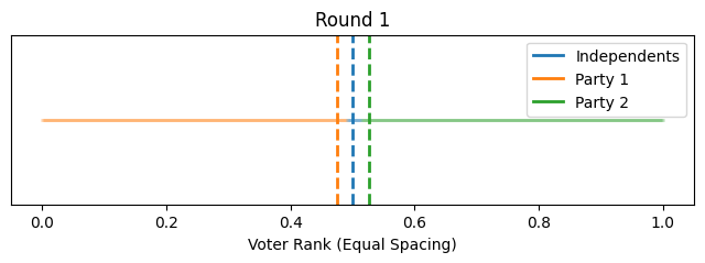
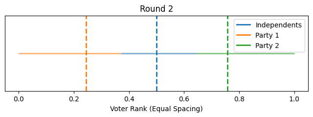
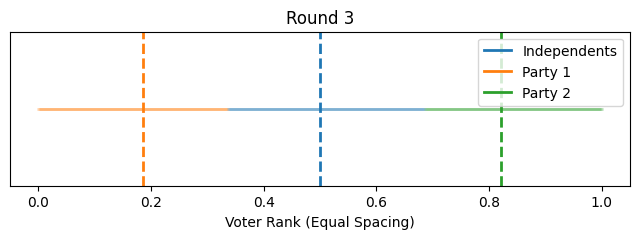


So that illustrates the intuition behind this toy model, how it could lead to political polarization between parties and growth in independents. However, one might notice that most of the polarization happened quite quickly toward the beginning (this is in part because I started independents as such a small group).
One could imagine extending this model such that affiliation switching is done with a lag as voters wonder, "has my party really left me?" and verify over several cycles that they are now closer to the center than to their party. Or perhaps switching could be done probabilistically according to a function of how far the party has drifted from them and over how many cycles.
Conclusion
So, what have we proved? Nothing. As mentioned up top, this is just a toy model and there are other plausible causes of party polarization. But I encourage you to go look at Allen Downey's post on the topic, where we can see that this move toward modern polarization took place shortly after national binding primary era started in 1972. In the absence of primaries, Hotelling's law suggests political parties would be more focused on nominating candidates positioned toward the median of the general electorate (or at least of the swing states), rather than the median of their own party. Hopefully this post gives some intuition as to how such polarization might arise under a few simplifying assumptions about party primaries and affiliation.